
Chest UI
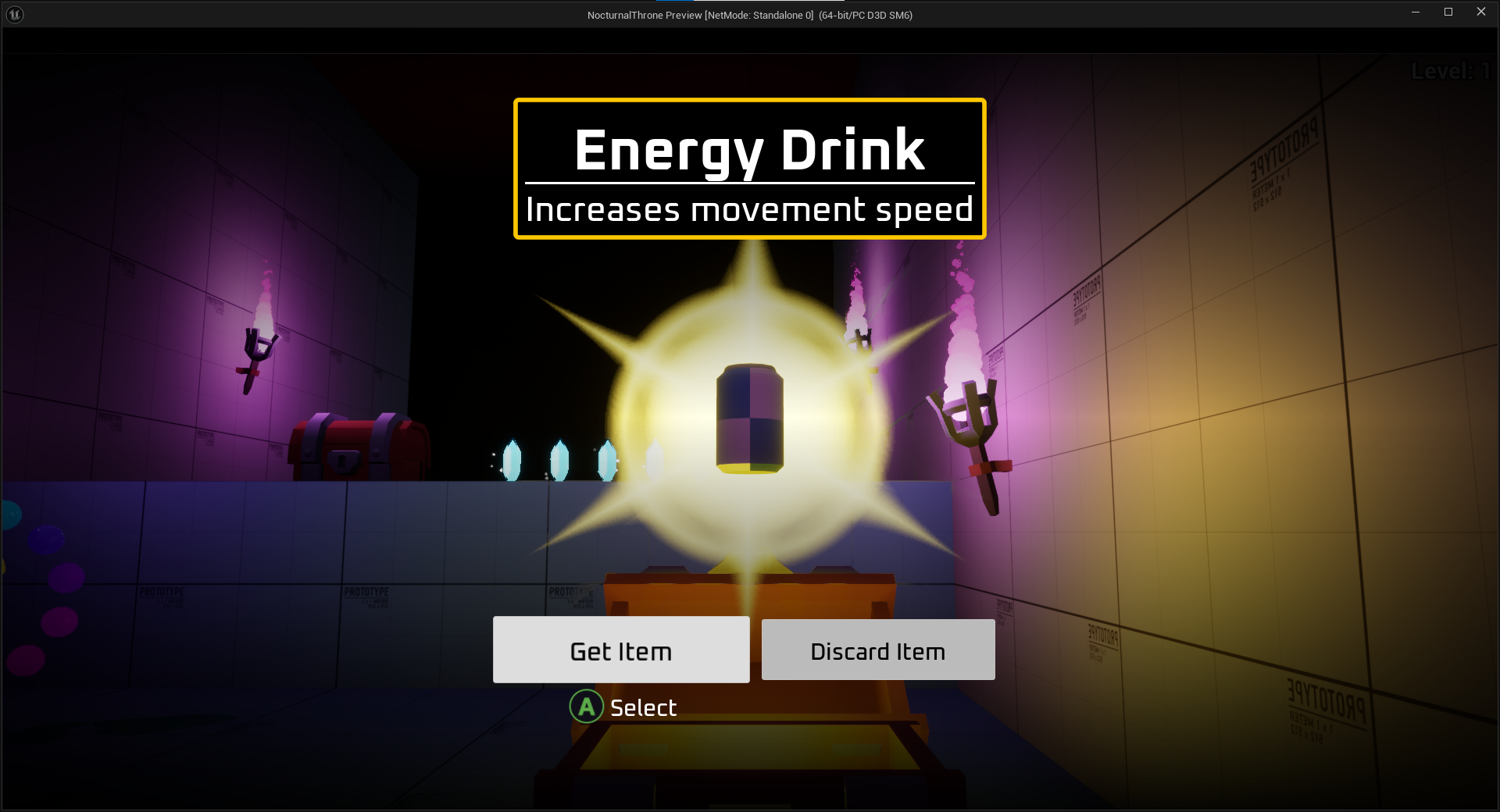
The polished user-interface.
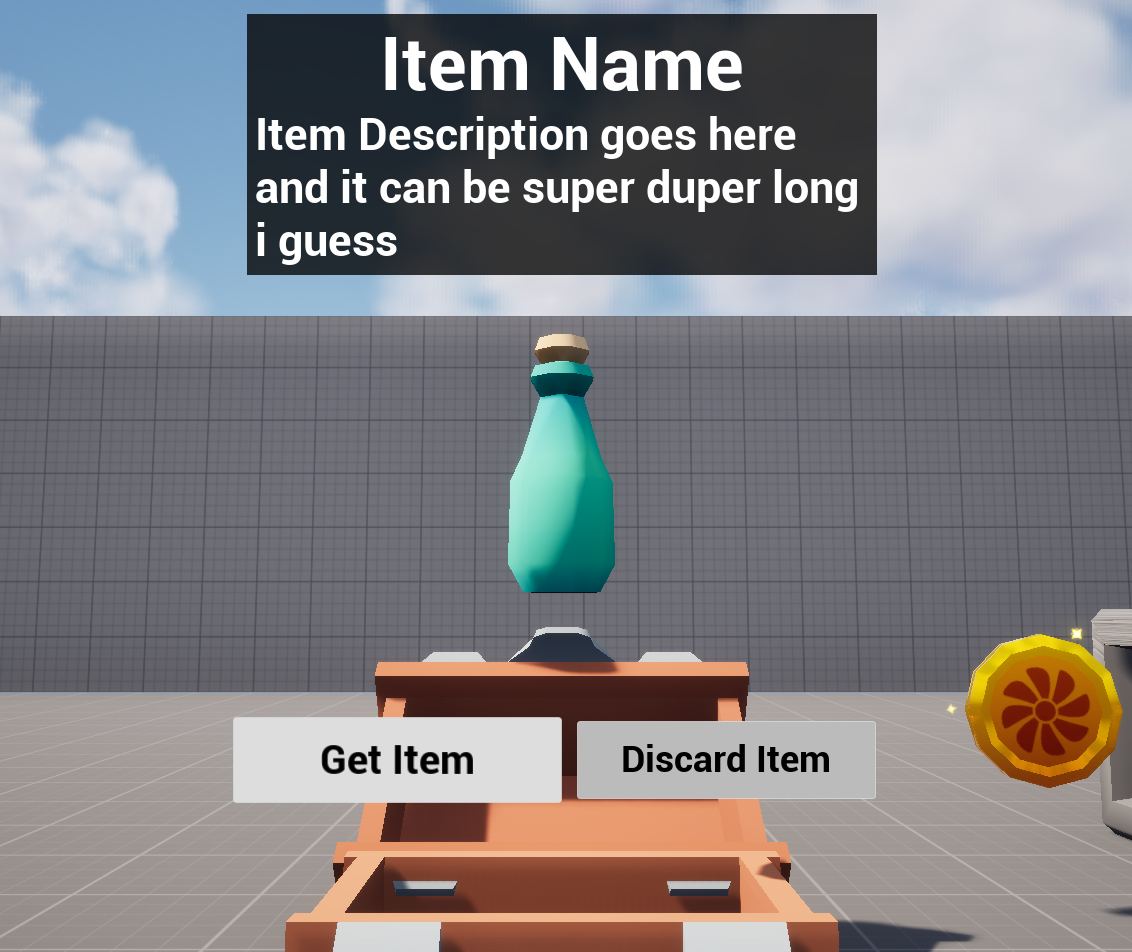
I needed a suitable UI for my game to get items from chests. I first got together this quick prototype to ensure that everything works fine before making it look better.
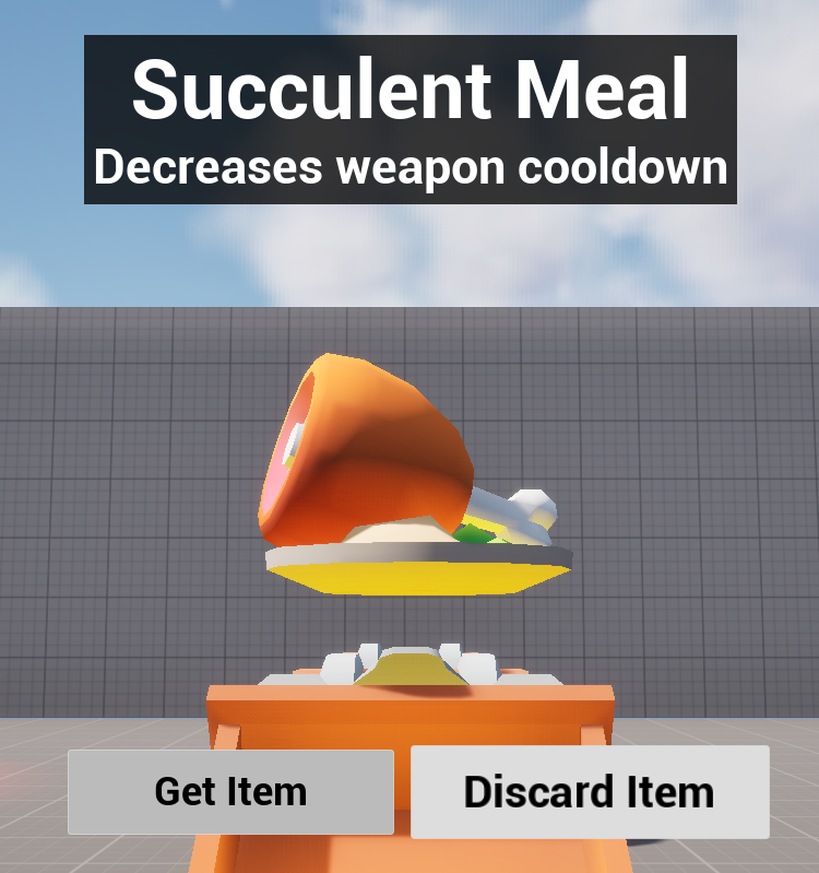
Since item's are stored as data assets, with all their data contained within. I can just feed the data asset to the UI, and it will display the correct model, name and description.
I then polished up the visuals of the UI and applied some effects to behind the item to give it a bit of extra juice.

Hint Rings
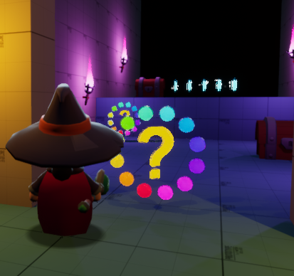
Hint rings are objects that are placed in several locations around levels. When walking into one, they will provide you with a hint. The hints will be context sensitive, meaning they will appear in areas where they are needed.
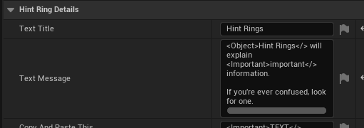
You can edit these properties of a hint ring. There is a title, and then a message. What they do is pretty self explanatory.
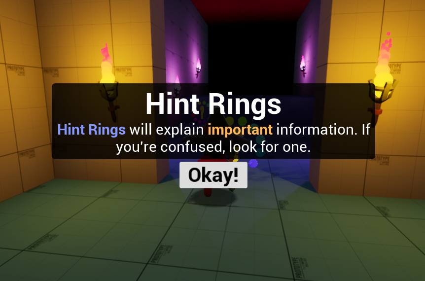
I started with this simple layout, which is the title on top, then the message below. There's a border around the text to help with readability, because otherwise the text may mesh in with the background.
Then of course there's an "okay" button, pressing this will close the hint.
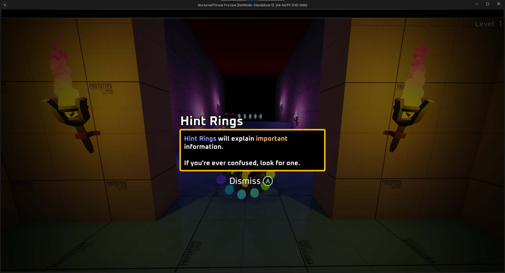
After I got the layout down, I worked on polishing it up a bit.
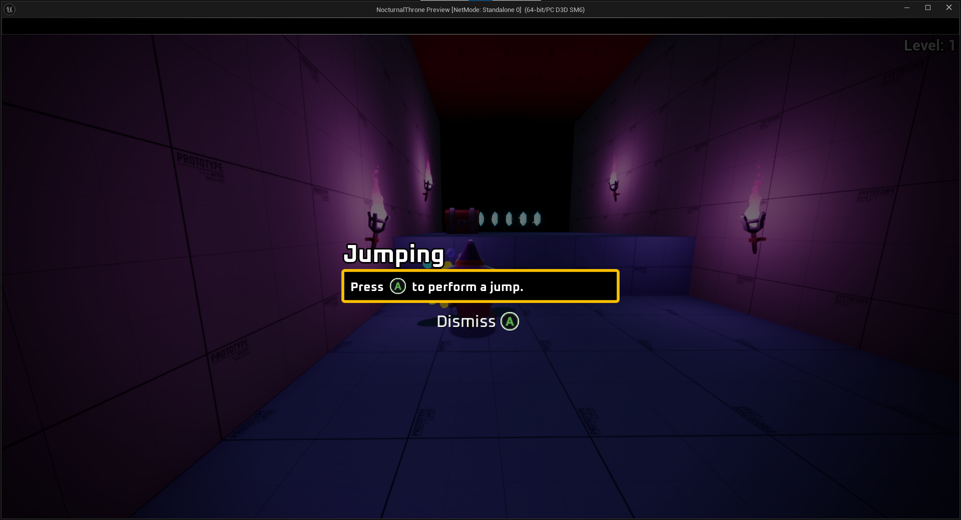
One important thing to note is that button prompts can actually be included in the hint via the rich images. This is another good reason I used the rich text option, since this is easier to read from a player's POV.